

A Homecoming Exhibition
A review of Clay Sinclair's recent exhibition.
La Mezz Gallery Audio Art Cafe, Hamilton
23 April – 16 May 2009
Have you heard about the painter, Vincent Van Gogh?
He loved colour and he let it show.
Lyric from Vincent Van Gogh by Jonathan Richmand and the Modern Lovers
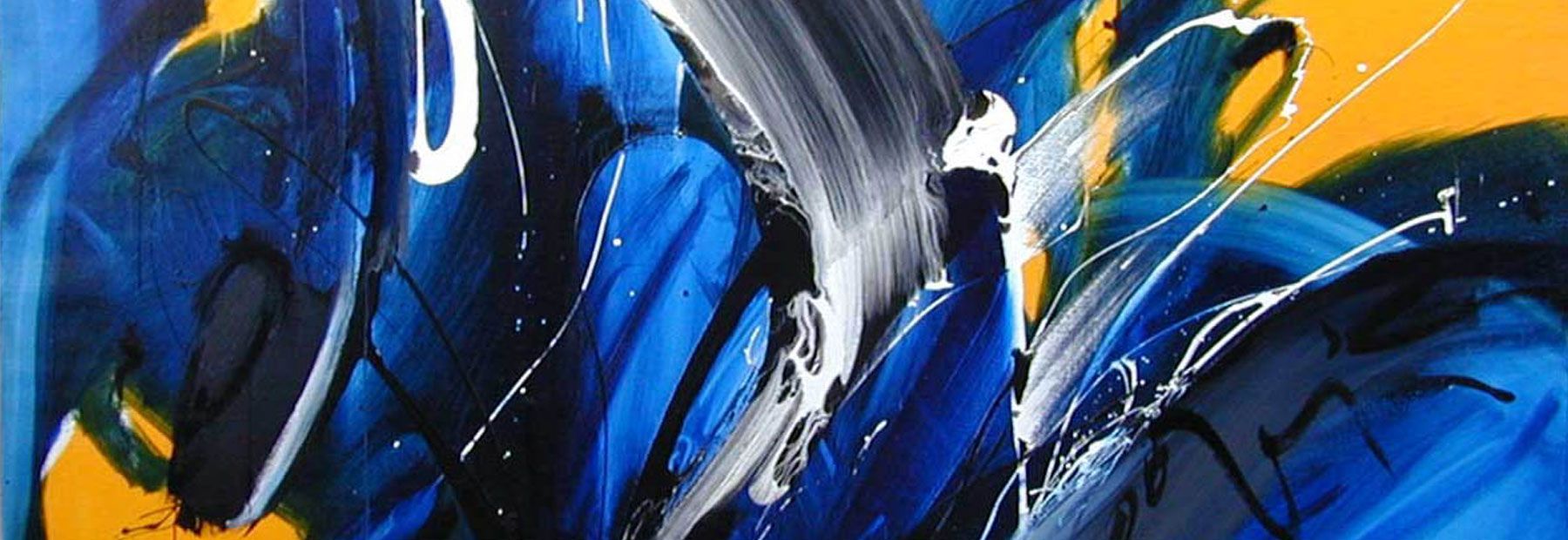
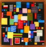
The words of Jonathan Richman’s lyrics resonate with the work of New Zealand born (Oxford, England-based) artist Clay Sinclair. If there was an order within which to read the elements used within his works, colour would come out at the top - pure, unashamed colour.
Having begun painting only four years ago, there is a solid degree of competency and skill that is unusual for one so new to the medium
In the tradition of great modernists, the artist uses the grid to maximise geometric compositional structure. He applies acrylic paint to the reverse of his Perspex surfaces to create a flawless finish.
Works containing texts could be exposing the ponderings of the artist or they could also be taken as truisms of the times. The artist seems to poke at academic and viewer critique; or the statements may be interpreted as the artist’s observations of viewer response in a gallery setting; perhaps quotations of overheard conversations at gallery openings? Where there is no physical texture on the surface, there is definitely an undulation created by different depths and colour temperatures that make these works operate effectively as highly textured and painterly works.
The colour throughout Sinclair’s works balances up the realism he provides us by the allusions to the recession and his seemingly apologetic approach to having to price his works. There is a certain intensity to the words permeating his works, which leads me to question if the absence of words would have made the same kind of visual impact on first glance. ‘Stop’ is a great example of this. Sinclair’s keen eye for design and visual balance is reminiscent of beautiful urban images of city lightscapes.
Reviewed and written by Leafa Janice Wilson.